Aquacomms
Reimagining legacy for future growth
00

problem
Aquacomms needed to evolve. As a recognised name in subsea connectivity, their brand held weight—but it felt dated. They were entering a new growth phase and needed to reflect that without losing what made them credible. The challenges were clear: -Honour their decade-long heritage while pushing forward -Refresh the visual identity without losing recognition -Define messaging that balanced authority and innovation -Unite internal teams around a clear, confident direction -Build a digital experience that supported international growth
solution
I led a full-scale brand transformation, grounded in strategy and built to scale. Discovery & Positioning -Ran stakeholder interviews and competitor analysis -Identified brand gaps and decision-maker priorities -Defined Aquacomms as “The Future of Subsea”—a narrative that anchored past, present and future Visual Identity -Created a modular system using fluid dynamics and signal-based motifs -Refined the logo for sharper digital use while preserving brand equity -Built a flexible colour palette with tones of technical depth and innovation -Crafted a full set of brand guidelines for consistent global rollout Digital & Content -Rebuilt the website around clearer journeys and conversion points -Designed collateral templates and internal training tools -Delivered a full messaging system, from top-line narratives to sales copy
I approached Aquacomms with a clear mission: preserve the strength of their legacy while designing a brand ready for the next decade. Every choice in visual, verbal, and structure was made to reflect that duality.

I began with strategic discovery. Through interviews and journey mapping, I uncovered where the brand fell short, particularly in reflecting its innovation track record.
From there, I redefined their brand architecture and messaging. I created a positioning that firmly grounded them as future-facing, without disconnecting from their proven reliability.
Visually, I wanted the brand to feel engineered yet fluid. I created iconography inspired by waveforms and flow. Including subtle cues that hinted at movement, signal and scale. The colour system balanced trust with energy. Typography was chosen for clarity across digital and print.
On the web, I restructured the entire experience. The UI was simplified, journeys shortened, and content reorganised to drive leads. Every touchpoint was built to align with the new brand and deliver clarity from first click to contact form.
year
2023
timeframe
2 months
tools
Webflow
category
Branding and Identity
01
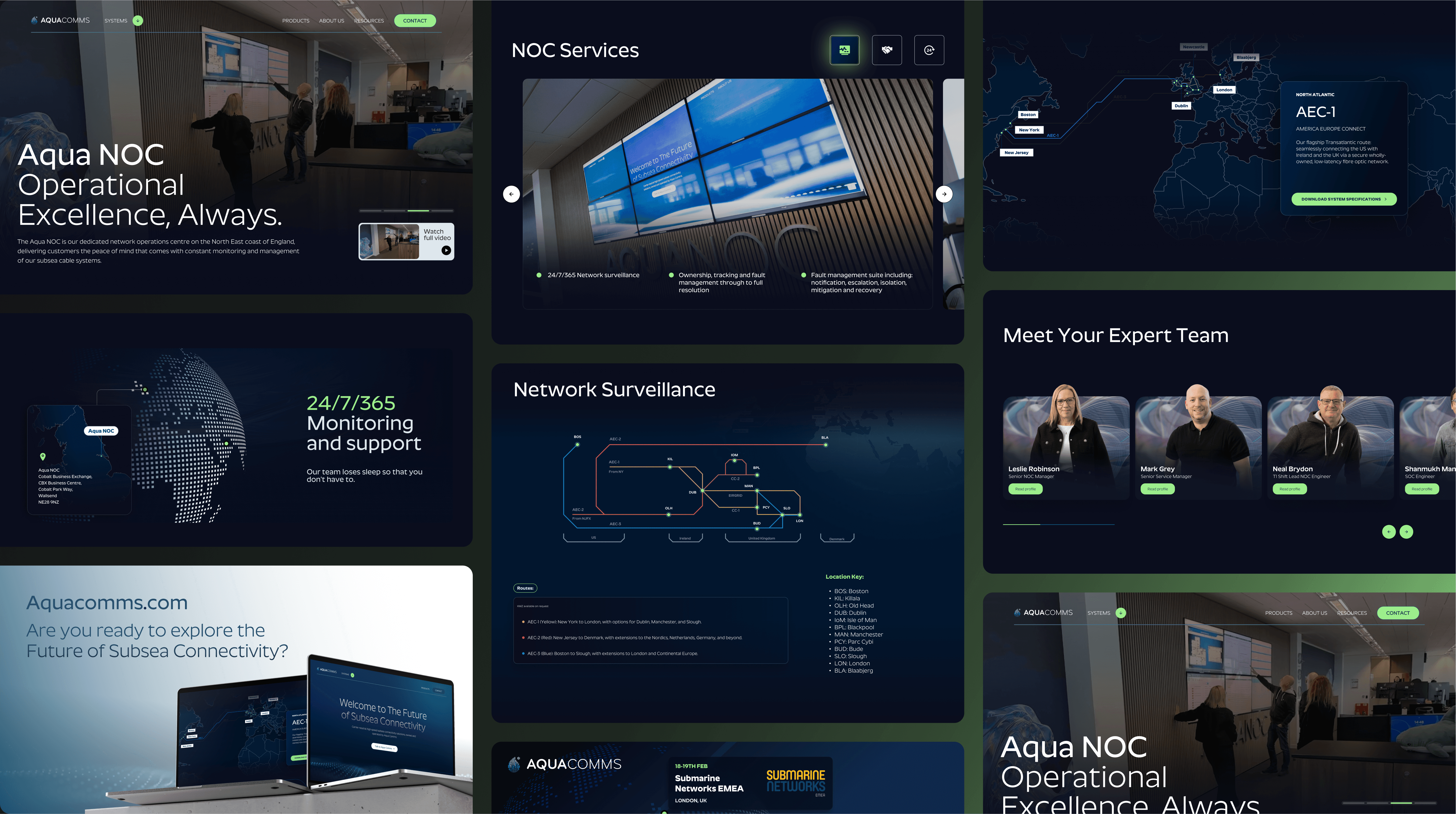
Close-up of the Aquacomms UI displaying new wave-inspired iconography and headline
02
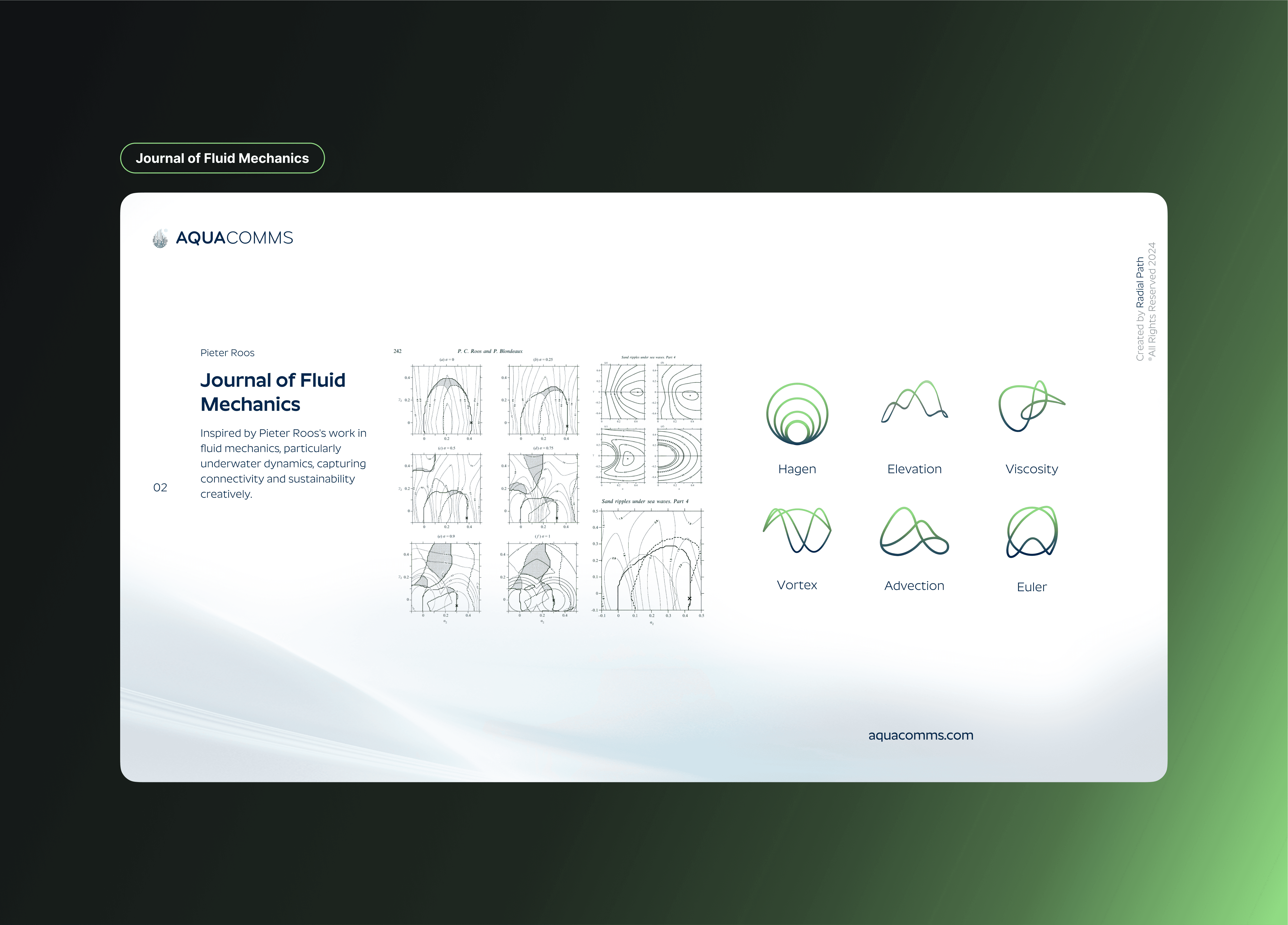
A visual exploration of AquaComms’ icon system inspired by fluid dynamics, featuring forms named after key concepts like Hagen, Euler, and Vortex—rooted in research by Pieter Roos and the Journal of Fluid Mechanics.
03
Aquacomms
see also


