SGGS
Building a global brand platform for network expansion
00

problem
SG.GS had strong momentum in APAC—but their brand wasn’t ready for international growth. Key issues included: -Visual identity lacked global sophistication -Messaging didn’t translate across cultures -The website failed to reflect their technical edge -They needed to attract global talent while preserving local equity -It was a classic rebrand challenge: evolve without losing who they are.
solution
I led a brand transformation that redefined SG.GS for global scale—visually, verbally, and digitally. Strategy & Messaging -Conducted market analysis across APAC, EMEA and North America -Positioned SG.GS against global network leaders -Developed a full messaging architecture tailored to enterprise buyers -Built clear product value propositions and internal playbooks Visual Identity -Refined the logo to keep brand equity while improving global legibility -Built a modern design system—technical but approachable -Created an image library and guidelines for cross-region consistency Digital Execution -Rebuilt the website with international audiences in mind -Restructured content for clearer product journeys and technical credibility -Designed sales and marketing collateral for localisation at scale -Aligned social media channels to the new global brand voice
I took SG.GS from a respected APAC brand to a credible global contender. Every touchpoint was rethought—from pitch decks to pixel grids—to help them scale confidently.
The brief was clear: modernise the brand for global expansion, without losing what made it resonate locally.
I started with strategic positioning. After studying market competitors, I clarified what SG.GS stood for globally and codified their value into a usable messaging system. The voice became clearer, more consistent, and better suited for enterprise buyers.
Visually, I evolved the logo subtly while building a bold new identity system—one that signals performance and trust across borders. Typography, colour and layout all worked harder to carry weight in international markets.
Digitally, I rebuilt the website architecture around clarity and conversion. Key product pages were rewritten, regional content was introduced, and the structure was designed to scale.
The work extended to internal comms, sales decks, event materials, and social channels—all now aligned under one brand story.

impact
The brand launched successfully with:
A measurable increase in international leads
Stronger perception among telecom and enterprise buyers
Positive internal adoption and cross-team usage
A flexible, scalable system now used across global markets
SG.GS now shows up as a confident global player—without losing the edge they built in APAC.
year
2023
timeframe
30 days
tools
Webflow
category
Branding and Identity
01
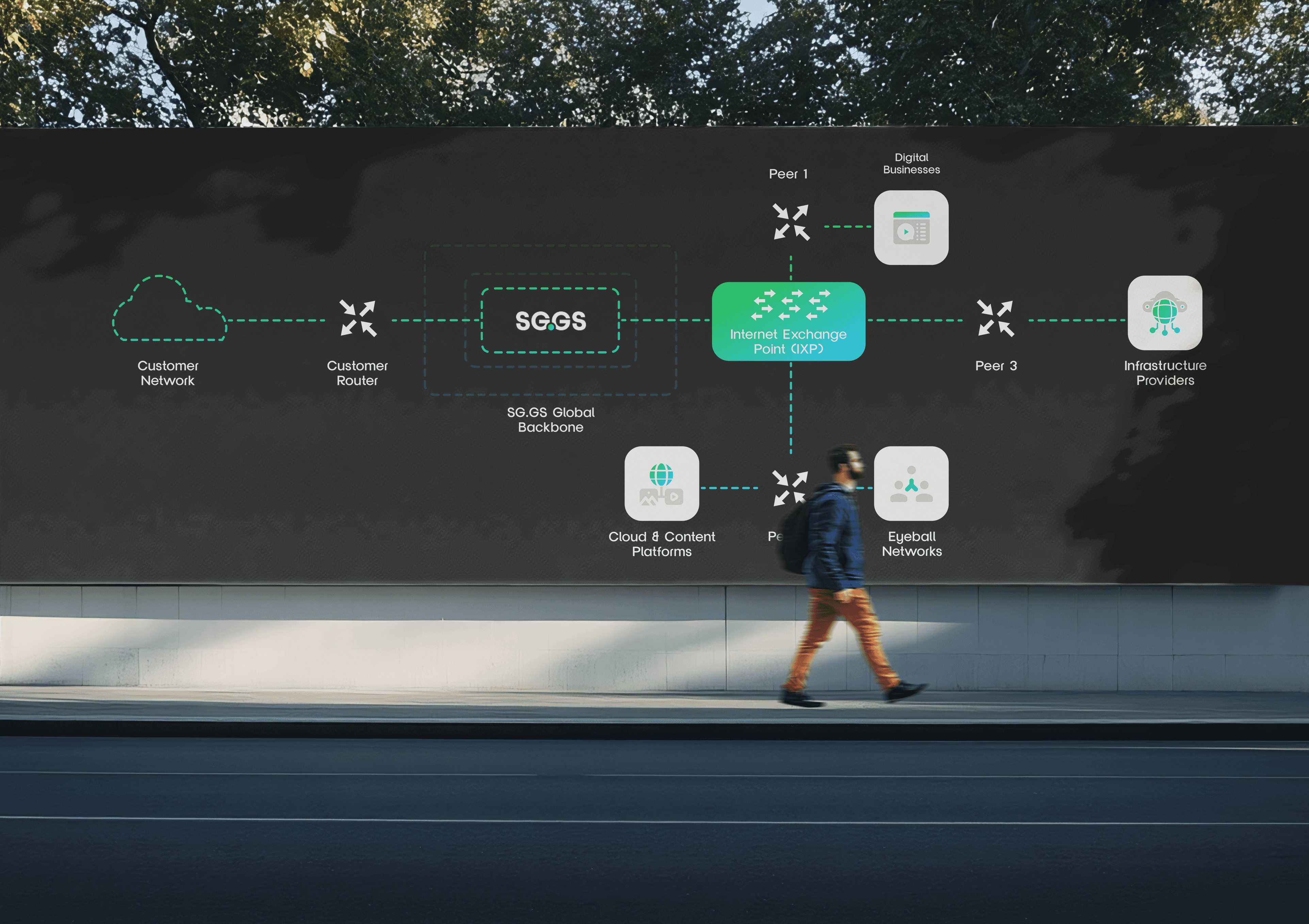
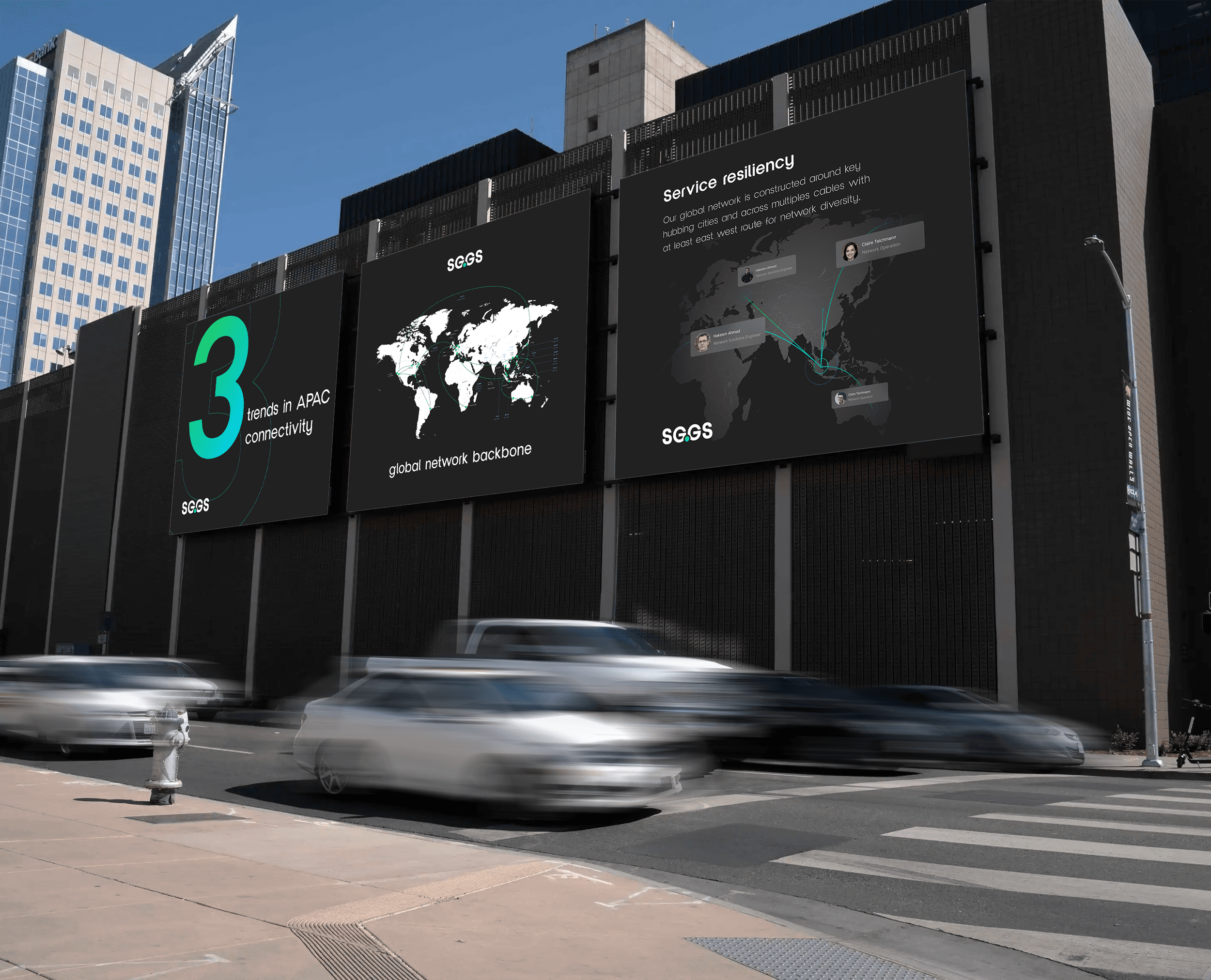
Regional applications.
03
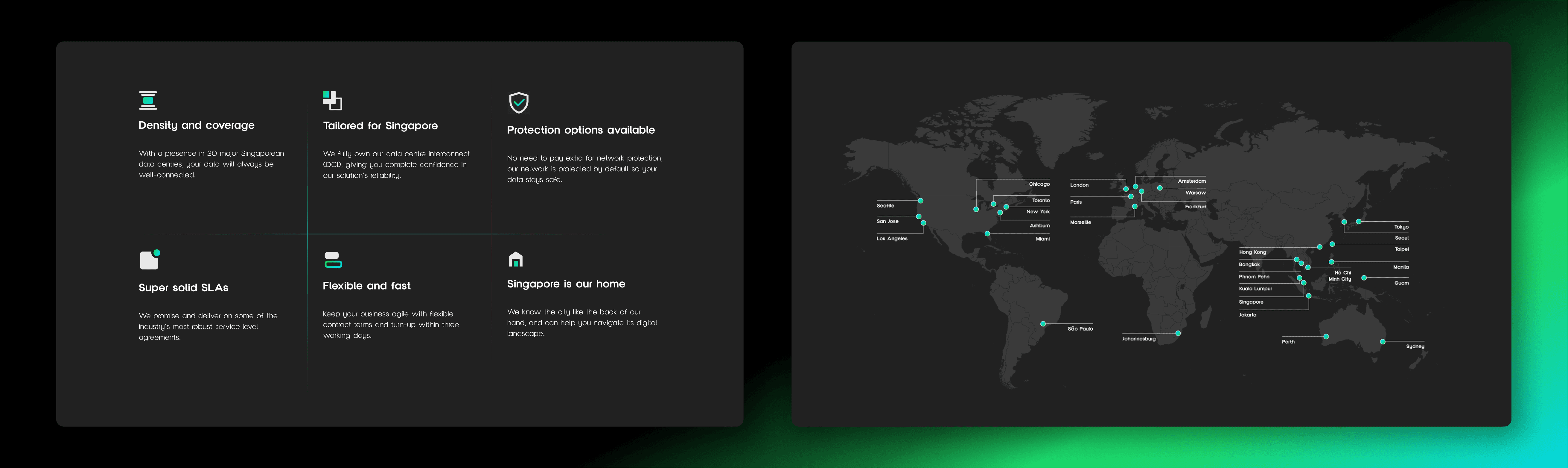
Global network map styled with the new brand identity, showcasing SG.GS’s reach.
see also


